SMarina.NYC
UX Designer Working Across Disciplines
THE PROJECT:
Overview: As part of a visual design course that I took at the General Assembly, I was asked to translate a creative brief into a comprehensive brand and design strategy for a start-up, LiquidLab.
The Goal: To raise awareness of the LiquidLab brand as a boutique cold press juice bar which offers their customers unique juices and smoothies.
DELIVERABLES:
- Objective & Strategy
- The Competition
- Mood boards
- Mockups
- Type, Color and Photography
- Final Design (Desktop + Mobile Web)
1. OBJECTIVE AND STRATEGY:
The objective for the brand is to enrich people’s lives by giving them access to healthy and delicious juices, either pre-made or customized.
I wanted the above objective to be easily attainable. As a result, I thought that creating a distinct online presence would be the best solution. Key features of an online presence included:
- Access from any device
- Try something new by exploring existing products
- Personalize their product(s).
- Learn about LiquidLab and its values.
- Obtain healthy living tips.
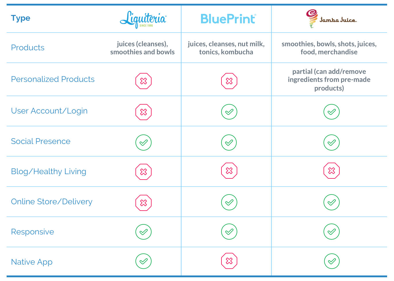
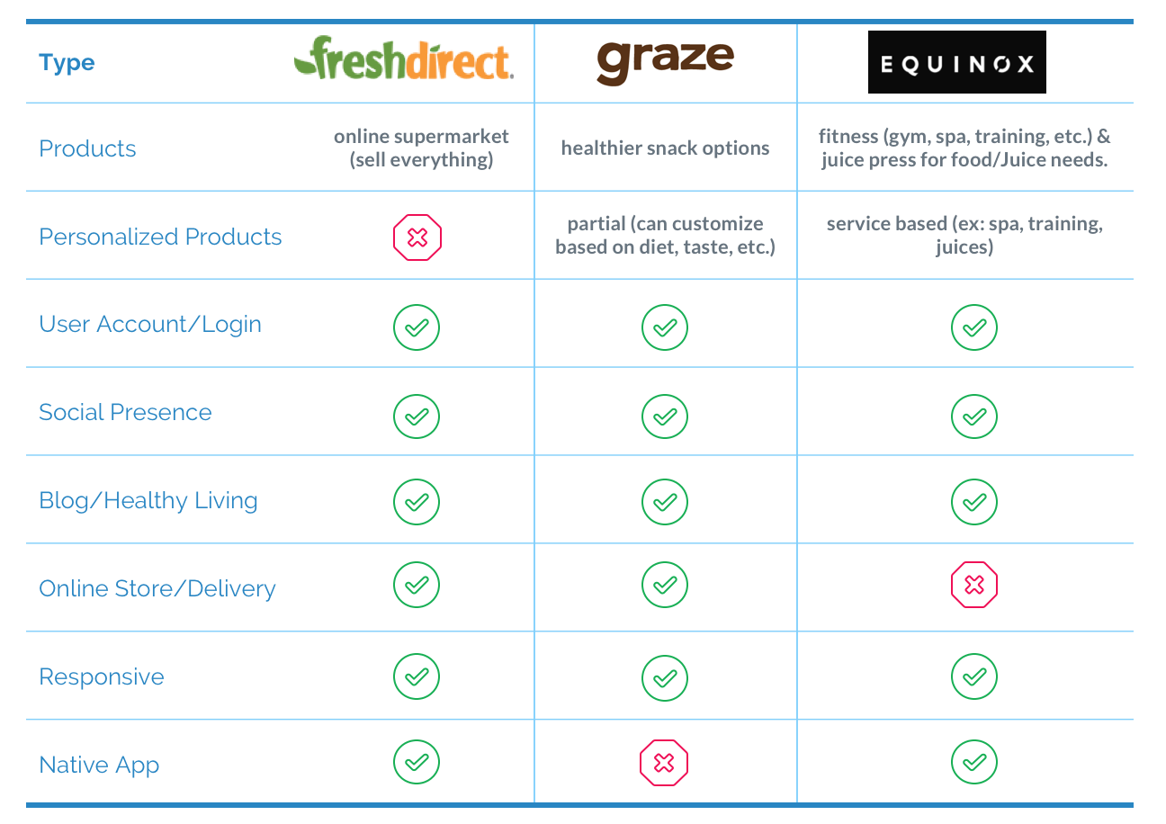
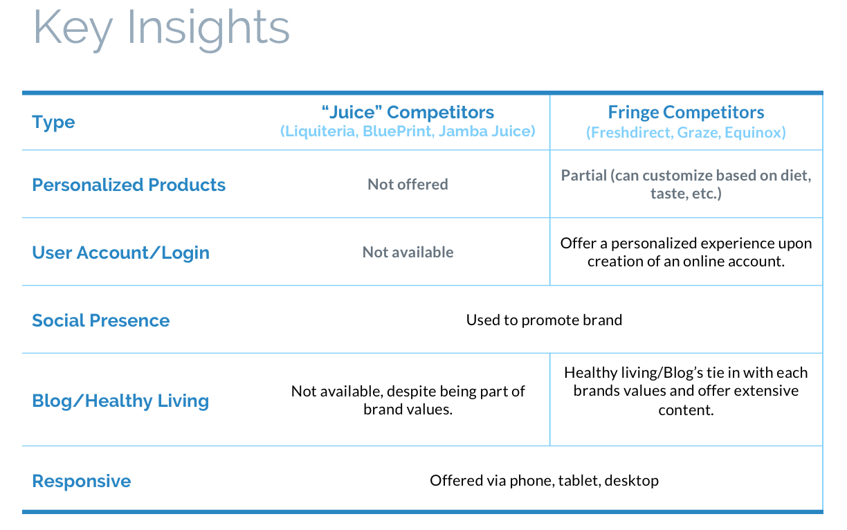
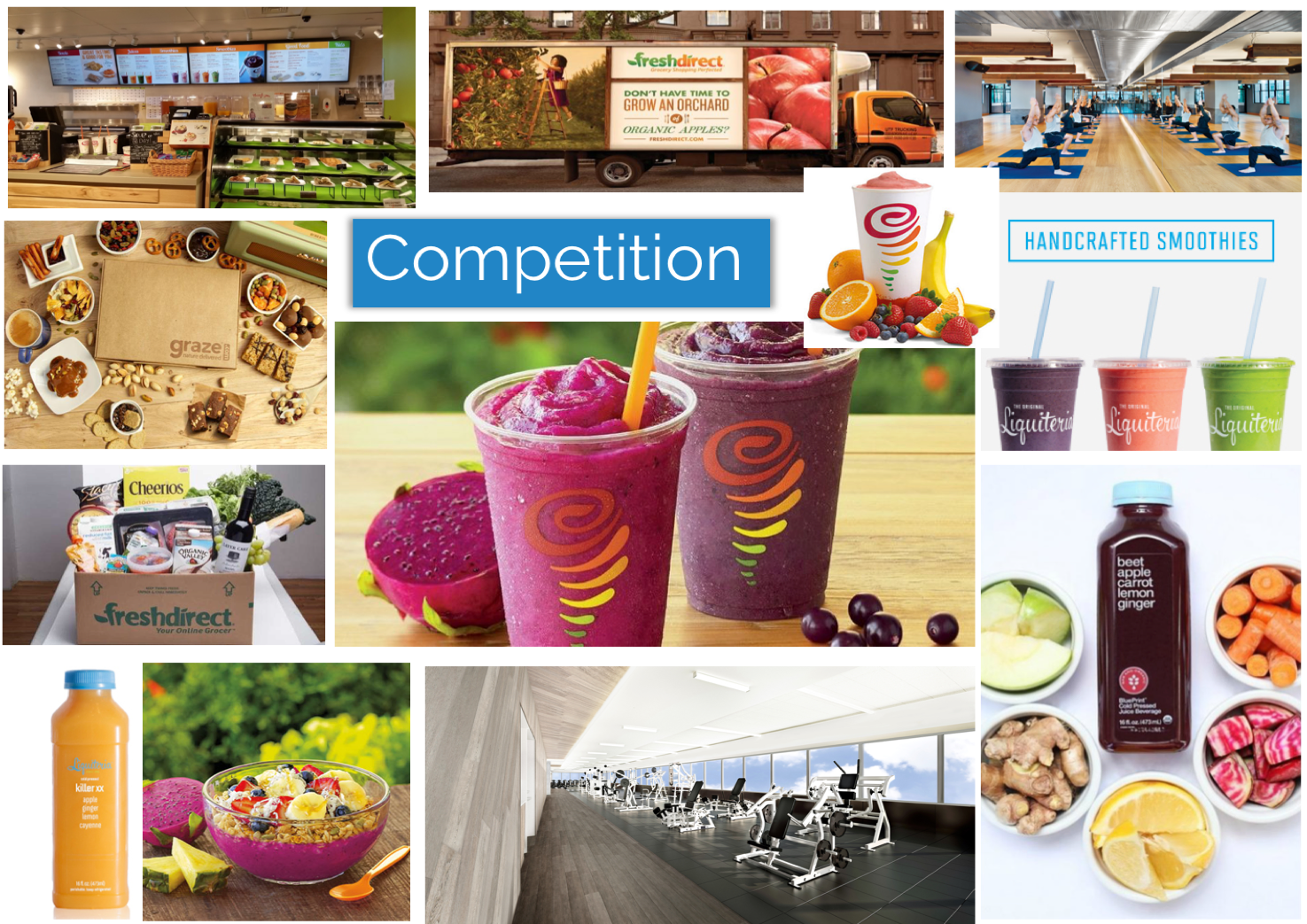
2. THE COMPETITION:
Looking at the competition served as the basis for what I wanted to include in my landing page. I explored two types of competitors, direct vs. fringe. The following illustrates my findings.
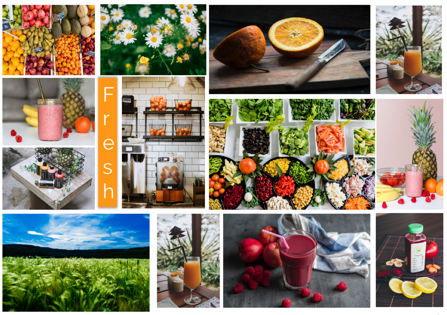
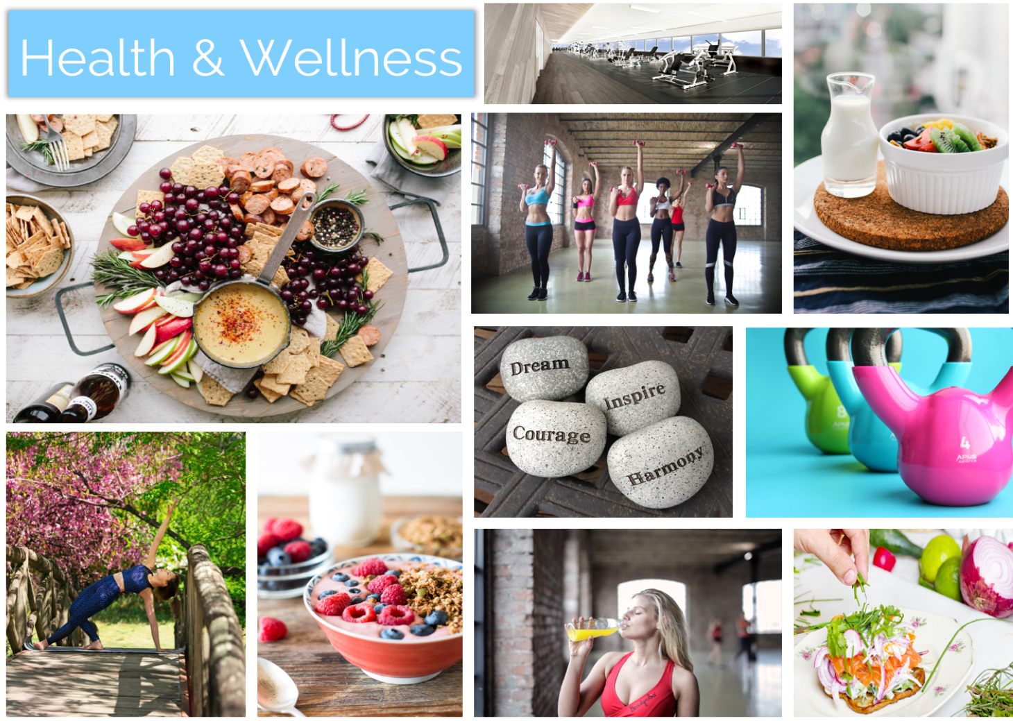
3. MOOD BOARDS:
I created three mood boards, focusing on Fresh, Health & Wellness and Competitors.
I choose keywords “Fresh” and “Health & Wellness” because they best aligned with the brand values of providing locally sourced juices/smoothies that fit into a healthy lifestyle.
These mood boards would serve as one of the elements informing my final design.
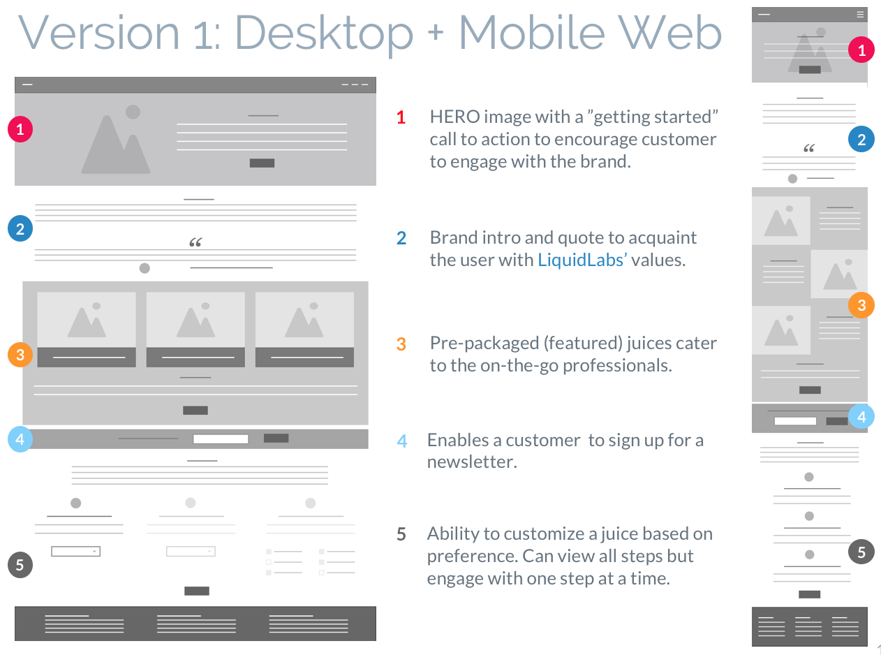
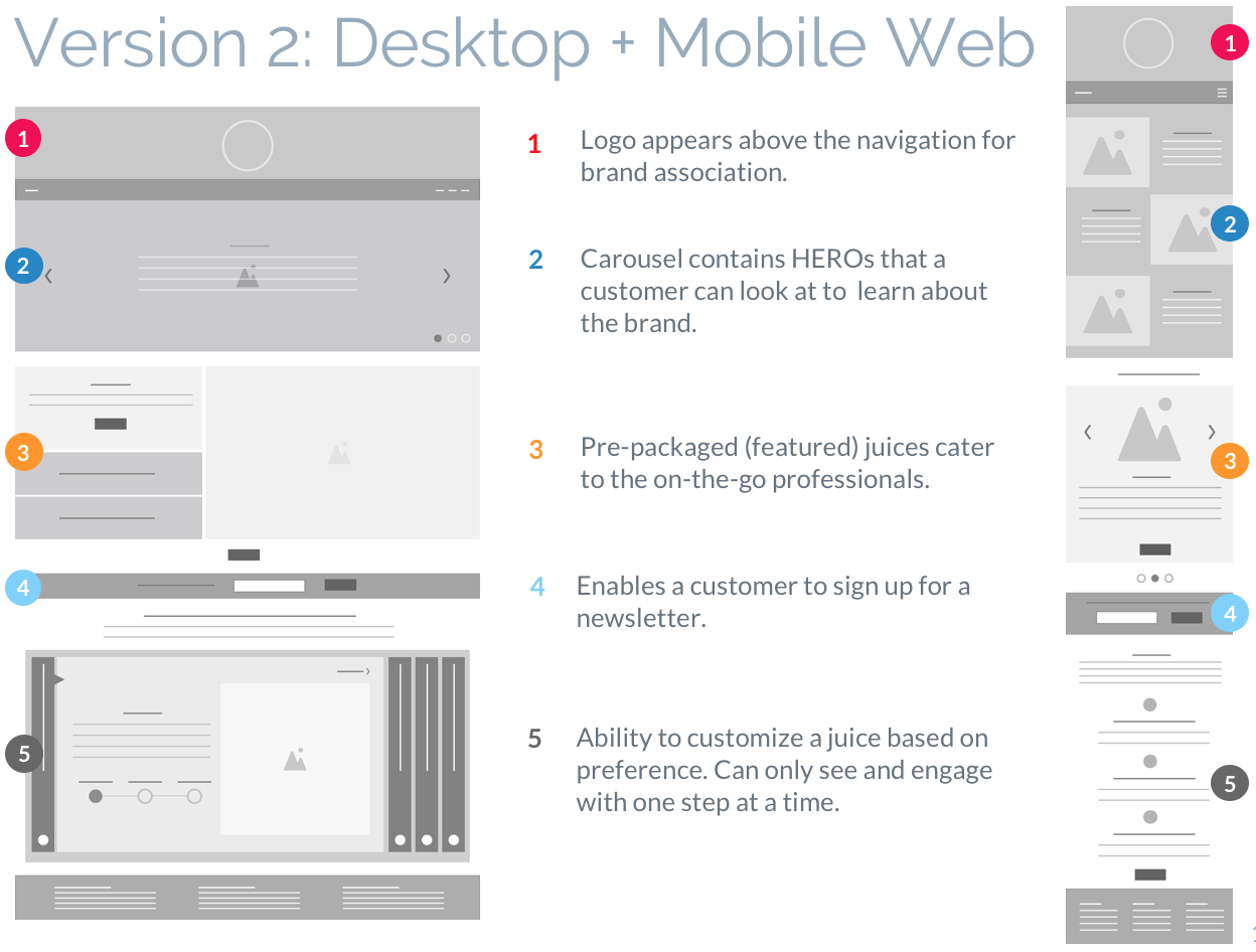
4. MOCKUPS:
A total of four low fidelity versions of the landing page were created (2 for Desktop + 2 for Mobile Web). The idea was to explore different layout elements/hierarchy within the page. In the end, I created a third version which was a hybrid of the ones below. The hybrid version was born out of research that I did with friends and family.
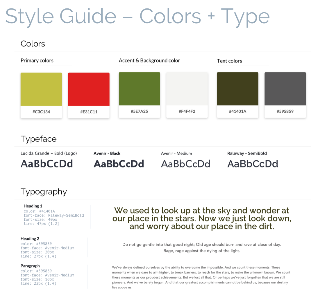
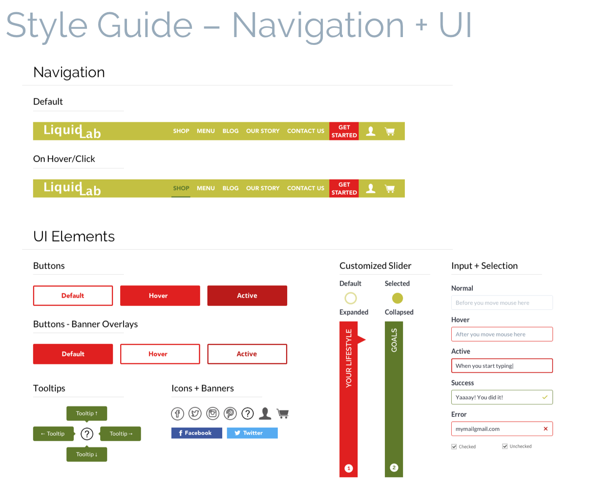
5. TYPE, COLOR AND PHOTOGRAPHY:
In defining the visual style, I wanted my design to accomplish the following. These elements were the basis of a style guide found below.
Typography – I paired Avenir (headings) with Raleway (body). The intention behind this pairing was to have a strong and bold title to contrast with a rounder body text, capturing the essence this brand has without being too overwhelming.
Lucida Grande was used for the logo as it was close to Avenir in boldness yet a bit more playful; a playfulness I wanted the logo to have.
Color + Photography – Mood boards, research and competitive analysis served to inform direction of the visual style of the brand: fresh and vibrant yet not overwhelming.
Color and imagery was used sparingly as to not take away from the ultimate objective of the brand; Enrich people’s lives by giving them access to healthy and delicious juices, either pre-made or customized.
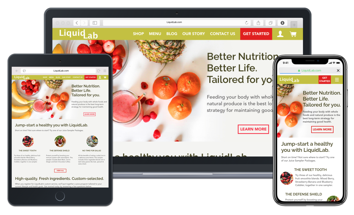
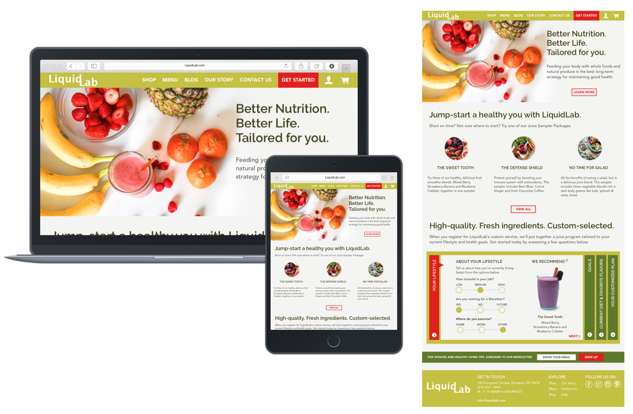
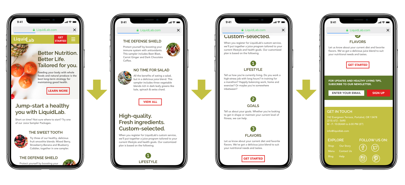
5. FINAL DESIGN:
In applying the visual style into the design, I made several design decisions in regards to photography, text composition and order of website information that altered the look and feel of the final landing page.
- HERO Image – A single image vs. a carousel was used to convey the central message of the brand.
- Pre-Packaged Juices – Ability to see the top 3 at a glance to quickly make a purchase decision (vs. one at a time).
- Customization Element – A quiz with a visual recommendation that guides the user to quickly create a personalized plan. The recommendation changes based on answers to the quiz.
- Newsletter Signup – moved to the bottom of the page, to keep the users attention on either purchasing a pre-made juice or creating a customized plan.
- Mobile Web – Customization element moved to a separate page as to not overwhelm the user viewing from a smaller screen size.