SMarina.NYC
UX Designer Working Across Disciplines
THE PROJECT:
As part of a UX Certification program at Pratt, I was tasked with delivering a solution for managing metro cards; a common pain point among New Yorkers. The process of managing metro cards can become fairly challenging (especially with more then one card in play), with riders often loosing their money when cards are misplaced, expired or lost.
As a New Yorker, I can sympathize with the “metro card challenge” as I often find myself with 3+ cards, all with various values, some expired or about to be. I have often wished for some sort of a solution for managing my cards so this project was the perfect challenge for me to tackle.
DELIVERABLES:
The project consisted of two central parts, research and design. Each part contained various deliverables, outlined below.
- Research: Research Plan, Overall experience feedback via interviews and Competitive Analysis
- Design: Sketches, Site Map and Wireframes
RESEARCH AND EXPLORATION:
I started by putting together a research plan that would address the pain point that I wanted to tackle; help riders manage their metro cards more efficiently. Interviews and competitive analysis served as a starting point within my project as it addressed the following:
- Sentiment among riders when it comes to using/managing their cards.
- Improvements/pain points that riders would like to see addressed.
- What currently exists elsewhere that helps riders manage their card(s).
After interviewing riders, the following became clear:
- Riders where unsure of what to do when they had a problem with their card; choosing to buy a new card instead.
- Riders tend to hold onto multiple metro cards in order to check their balances at the station.
- Some riders expressed a desire for a self servicing application that would enable them to perform various tasks (ex: check card balance, refill a card, etc.)
Upon completion of interviews, it was time for competitive research. The best examples of how transit systems function were found internationally. Highlights are outlined below
- Hong Kong – Octopus card which can be used in convenience stores, restaurants and other places.
- Seoul – Commuters can use their smartphones to pay for travel at ticket barriers.
- Copenhagen – Fully automated system that uses driverless trains, operating 24 hours a day.
THE DESIGN PROCESS:
Upon completion of both, user interviews and competitive research, it became clear that creating a self servicing application would alleviate many of the pain points that were expressed.
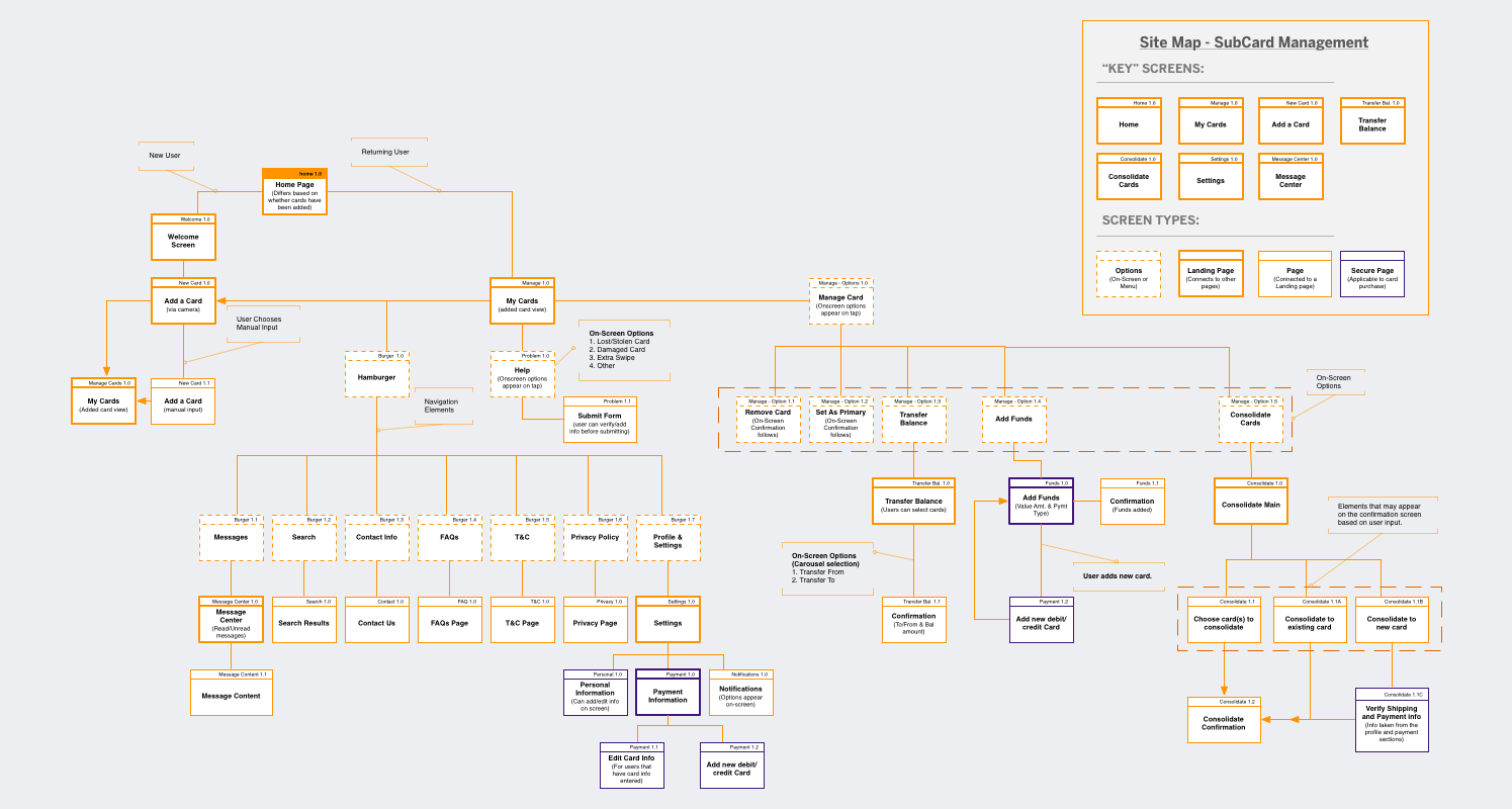
I started with mapping out my idea by jotting down features that riders mentioned and then incorporated those features into a site map.
Site Map served to:
- Map out the app to identify the major elements.
- Understand all screens involved in the card management process in order to assist with the sketching process.
- Identify any actions that may occur on-screen before the next screen is presented.
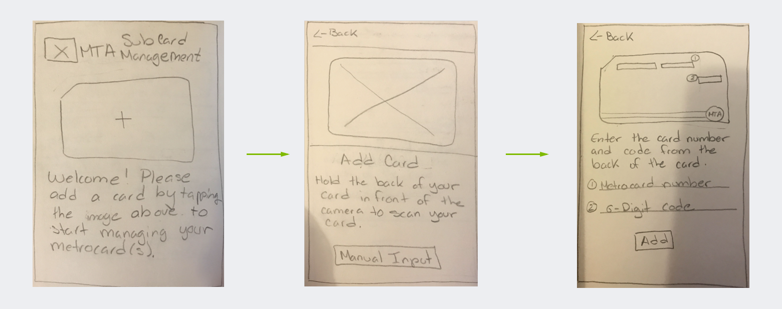
 After I had a clear sense of the end-to-end process, it was time to start sketching. I created sketches for key app screens that were applicable to the card management process.
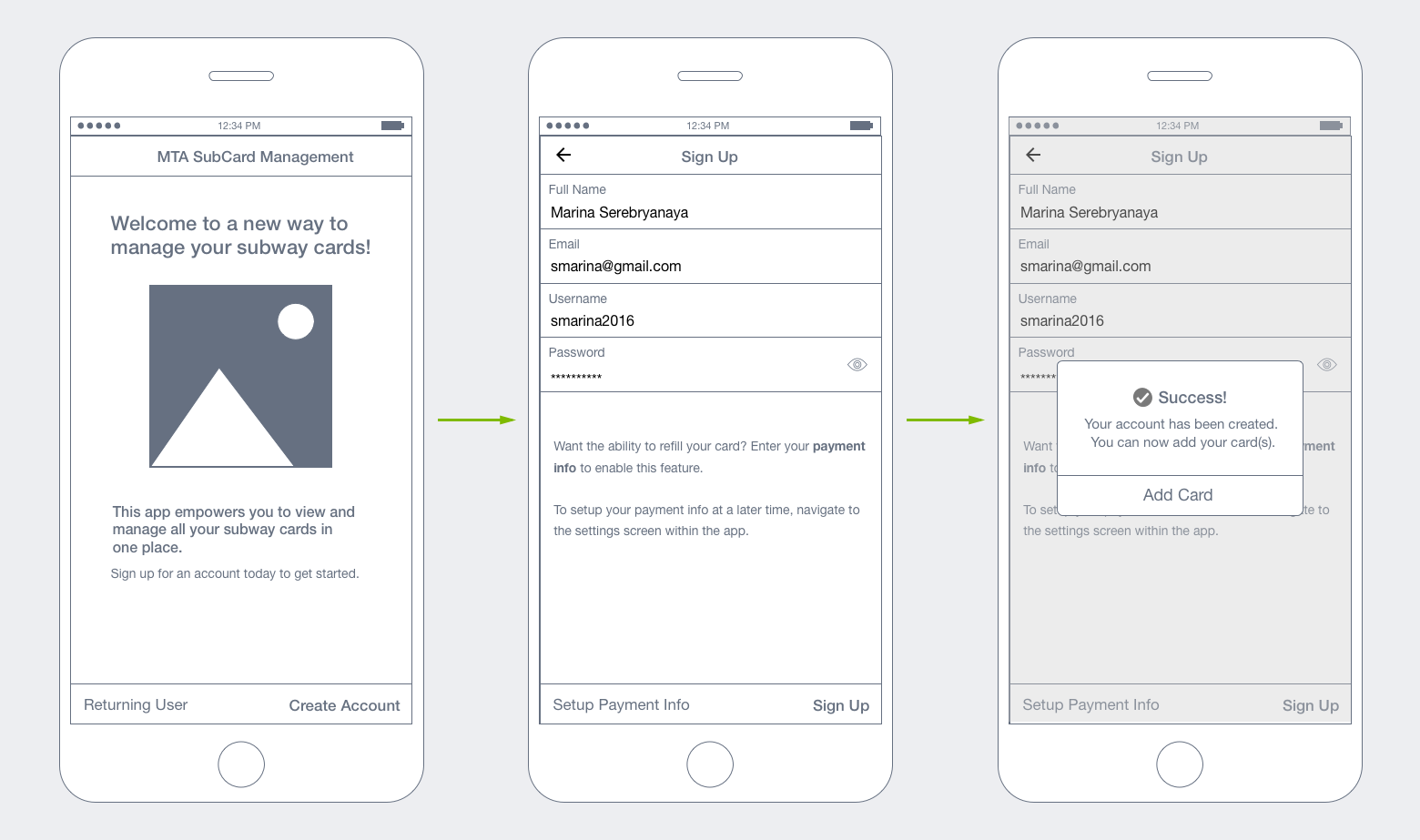
I began sketching the “Welcome and add a card walkthough” because I thought users would like to have an understanding of where to begin. This later expanded to a sign on process so users could feel more “secure” about the app (and feel confident about storing their credit card info for card reloads).
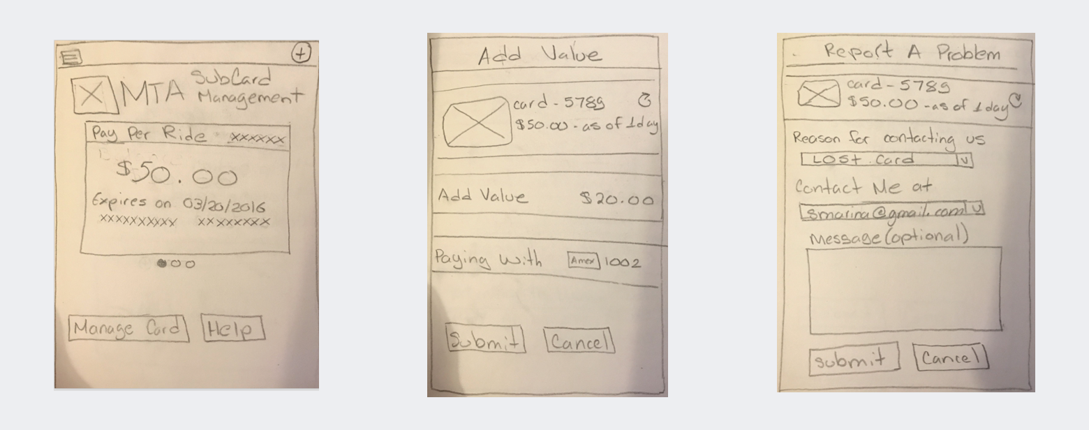
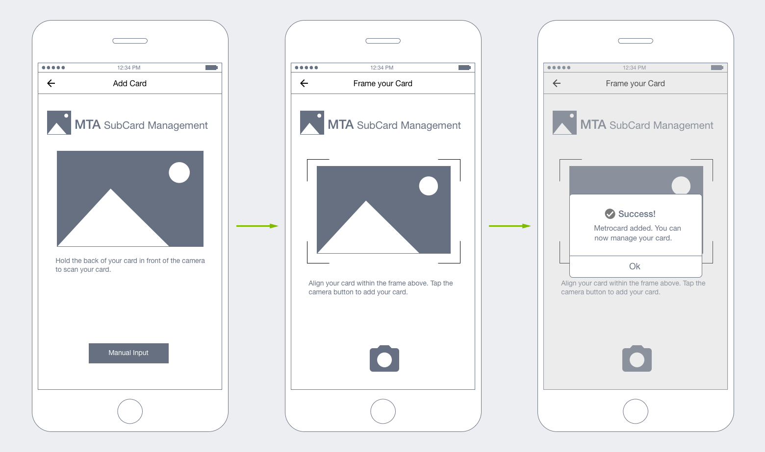
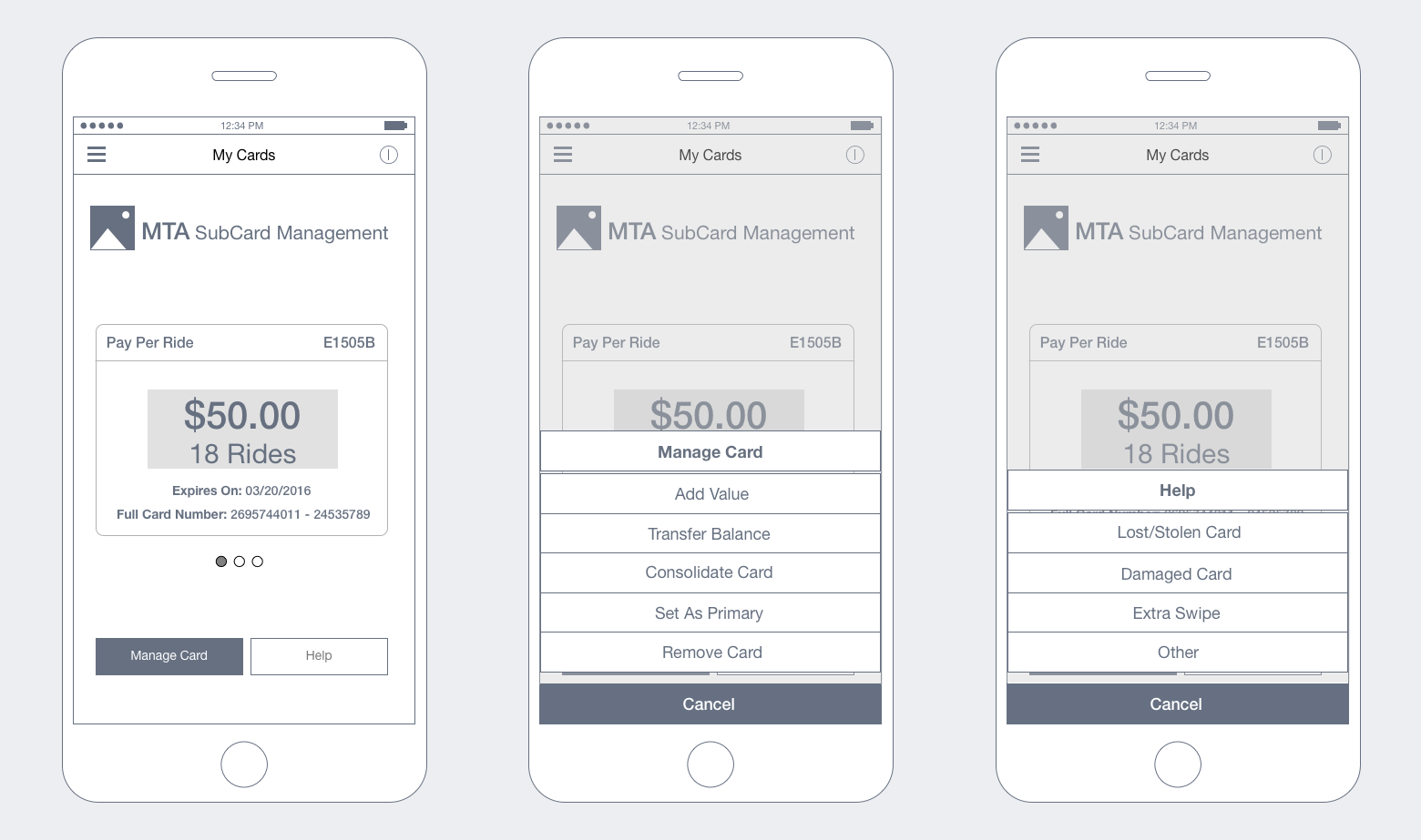
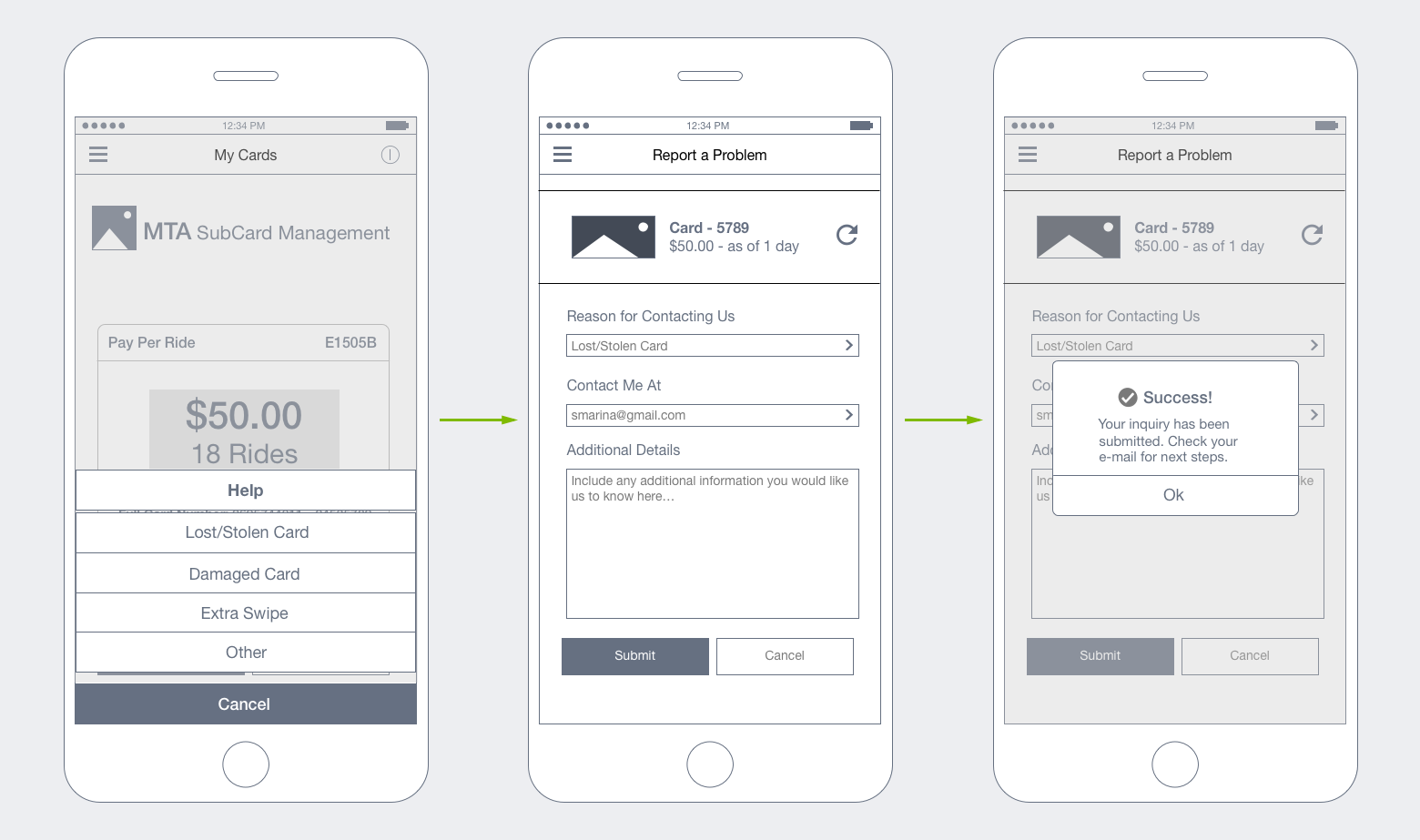
“Main” and “Secondary” screen sketches (respectively) depict key points in a journey that a user would hit if they choose to manage/get help with their card(s). As I began wireframing, I was able to fully incorporate these screens in order to map out a complete user journey.
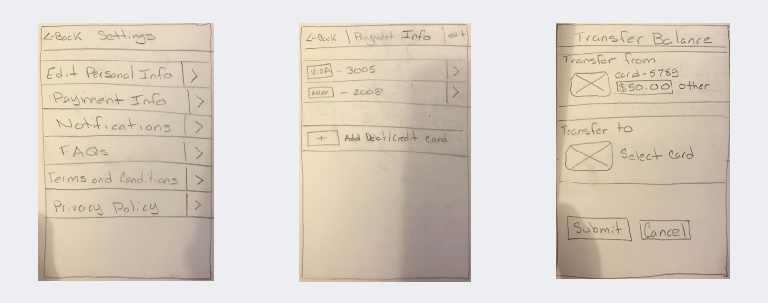
Wireframes reflect tasks that a user may want to undertake when managing their metrocard(s). These wireframes are the result of user research, competitive research and general assumptions that I had to make.
Next steps for this project will include creation of an interactive prototype and usability research. Results will be incorporated into a revised design that will provide the basis for visual design.