SMarina.NYC
UX Designer Working Across Disciplines
THE PROJECT:
In taking a UX course at NYU, I was asked to create an app/website of my choosing for a final project. As such, I decided to create an account servicing application for the Apple watch (just announced to the public). The idea behind the app was to allow users to manage their account(s) online from a single app, targeted at credit, debit and prepaid cards.
DELIVERABLES:
- Site Map
- Wireframes
- User Research
- Visual Designs
EXPLORATION:
I began with looking at as many news articles as I could get my hands on to familiarize myself with the apple watch. As the product was unreleased, this was the best way to learn about what was to come.
THE DESIGN PROCESS:
I started with creating a list of features which I wanted within the app. These features then fed into a site map. I followed the “beta” design standards (and a lot of speculation) to create wireframes that I thought might work. This proved particularly challenging as I had to “guess” on how certain features of the app would behave on the watch.
With an unreleased product getting a lot of attention, I knew user research was especially critical to the success of my app. I put together a research plan to test overall usability and features that I wanted included in the app. I uncovered the following:
- Users liked the idea of managing their account on a watch, reducing reliance on their phone(s).
- There was confusion as to how to navigate an apple watch app, many were unfamiliar with the gestures.
- Feedback was provided on information hierarchy and what was important to users.
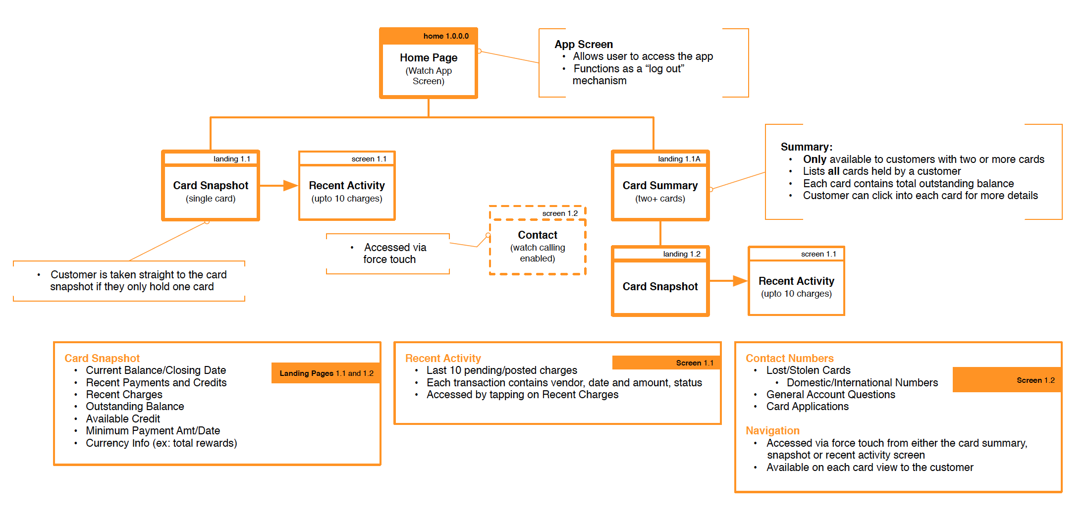
Upon completion of user interviews and release of the watch, I revised my wireframes and sitemap to reflect a more “realistic” product. I started with revising the sitemap first as it served as my guide in creating stronger wireframes.
Revised Site Map served to:
- Map out the app to identify the major elements.
- Understand all screens involved in the account management process in order to understand app navigation/usability.
- Identify any actions that may occur on-screen before the next screen is presented.
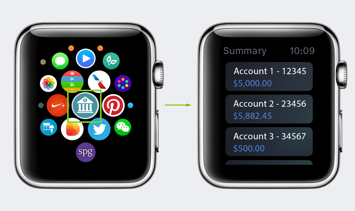
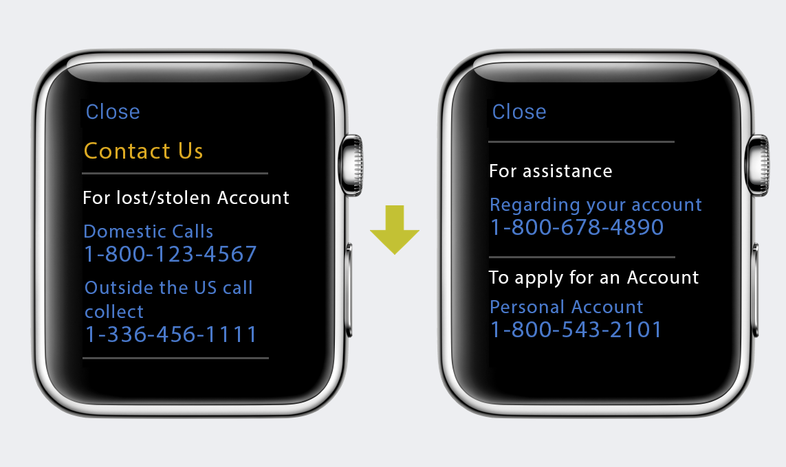
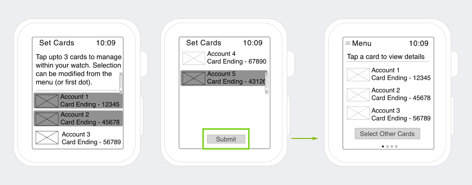
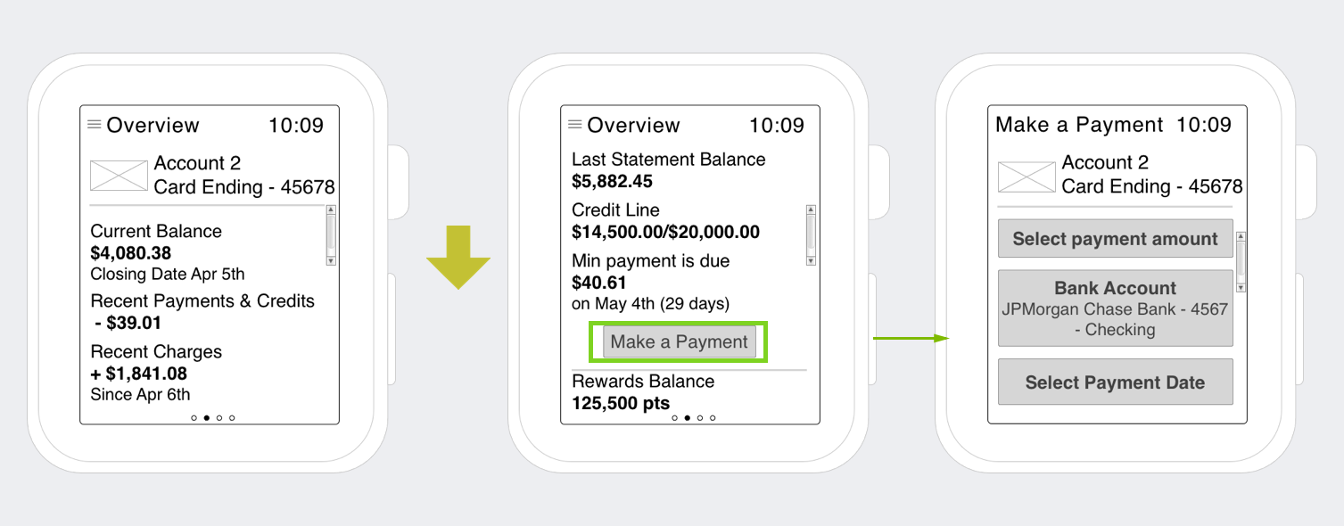
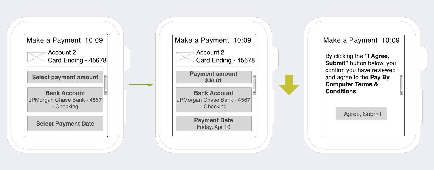
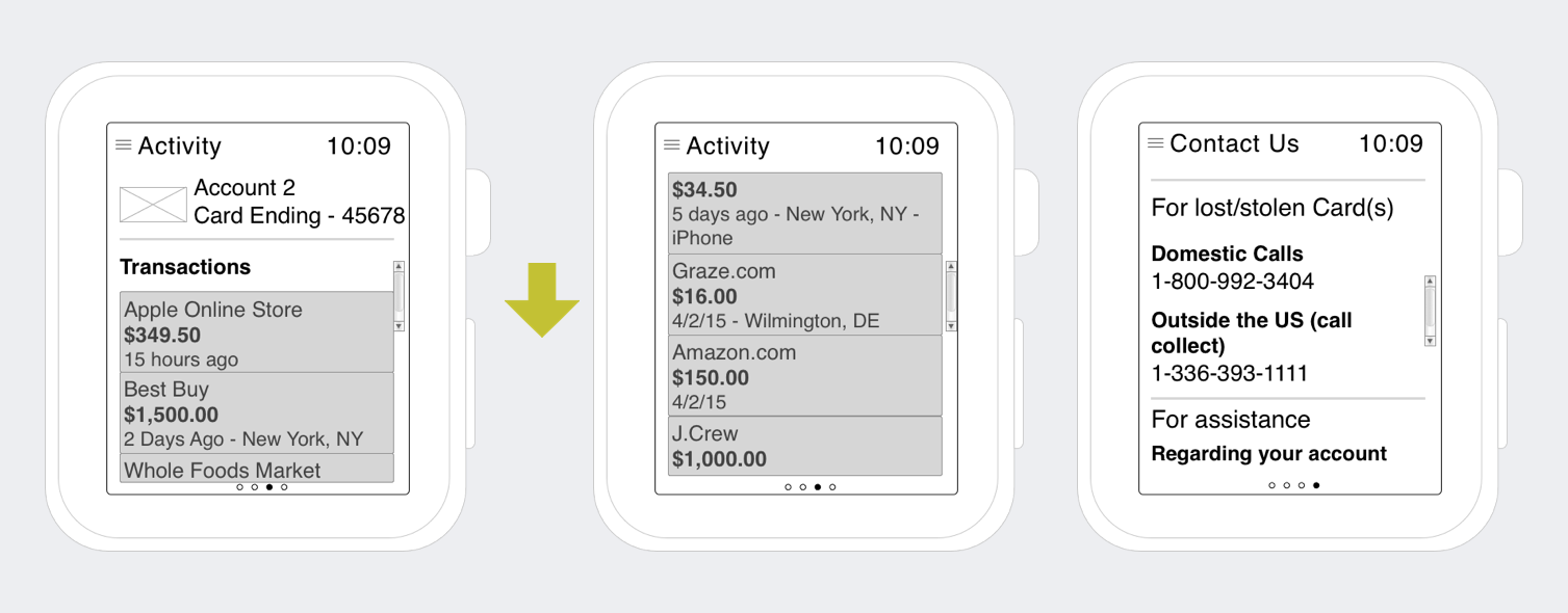
 After I mapped out my app, I went to work on modifying the wireframes below. These modifications were incorporated into the visual design.
The modifications to the wireframes were a direct result of finalized design standards and user research. Certain parts of the wireframes such as making a payment were de-scoped upon release of the watch. The de-scoping was due to a few factors such as navigation, reliance on the iPhone to pass information to the watch, and response time.


In taking user research and finalized design standards, I was able to create a visual design (below) that users would want to interact with and come back to.