Protected: Personas
CX Leader Working Across Disciplines
As part of a UX Certification program at Pratt, I was tasked with delivering a solution for managing metro cards; a common pain point among New Yorkers. The process of managing metro cards can become fairly challenging (especially with more then one card in play), with riders often loosing their money when cards are misplaced, expired or lost.
As a New Yorker, I can sympathize with the “metro card challenge” as I often find myself with 3+ cards, all with various values, some expired or about to be. I have often wished for some sort of a solution for managing my cards so this project was the perfect challenge for me to tackle.
The project consisted of two central parts, research and design. Each part contained various deliverables, outlined below.
I started by putting together a research plan that would address the pain point that I wanted to tackle; help riders manage their metro cards more efficiently. Interviews and competitive analysis served as a starting point within my project as it addressed the following:
After interviewing riders, the following became clear:
Upon completion of interviews, it was time for competitive research. The best examples of how transit systems function were found internationally. Highlights are outlined below
Upon completion of both, user interviews and competitive research, it became clear that creating a self servicing application would alleviate many of the pain points that were expressed.
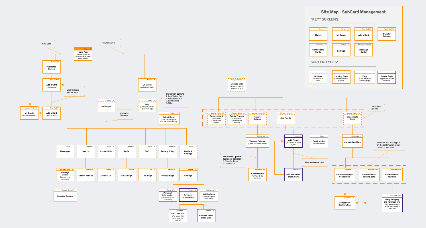
I started with mapping out my idea by jotting down features that riders mentioned and then incorporated those features into a site map.
Site Map served to:
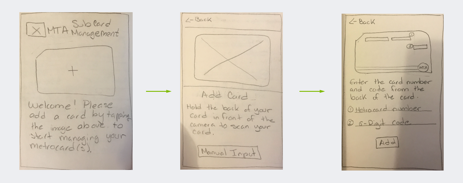
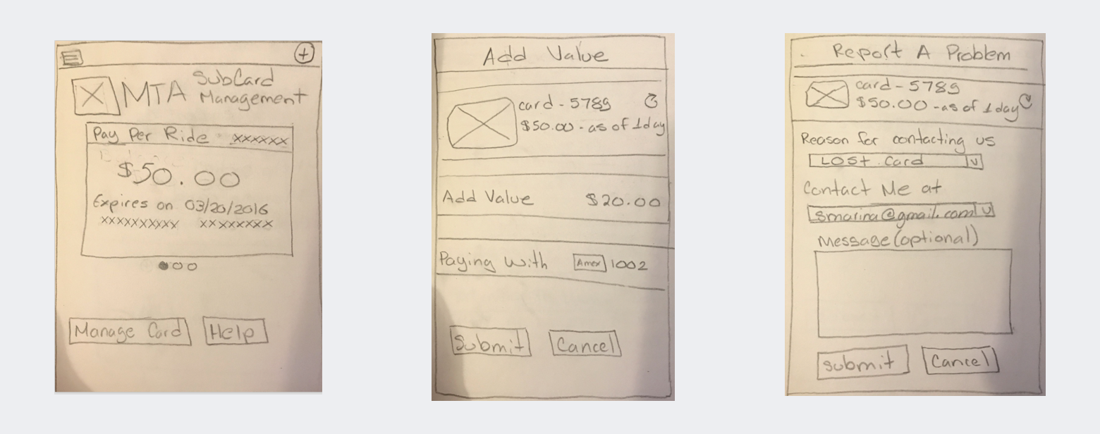
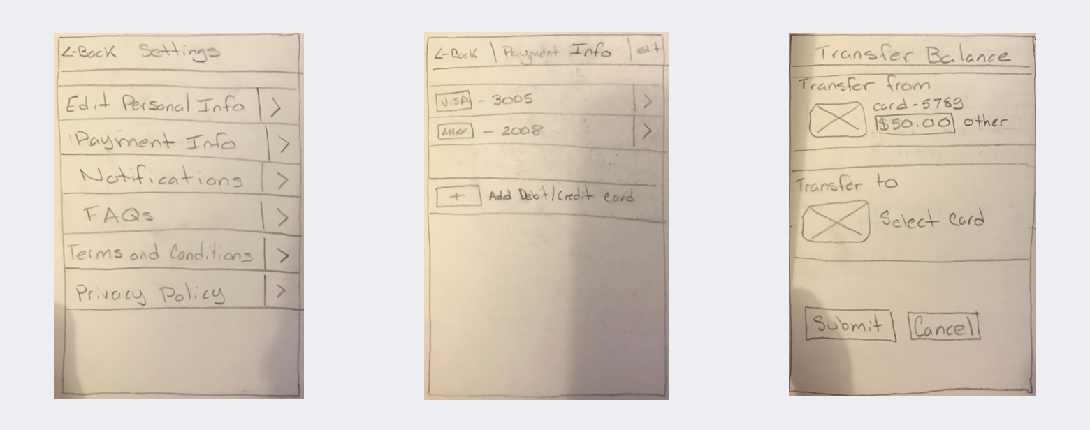
 After I had a clear sense of the end-to-end process, it was time to start sketching. I created sketches for key app screens that were applicable to the card management process.
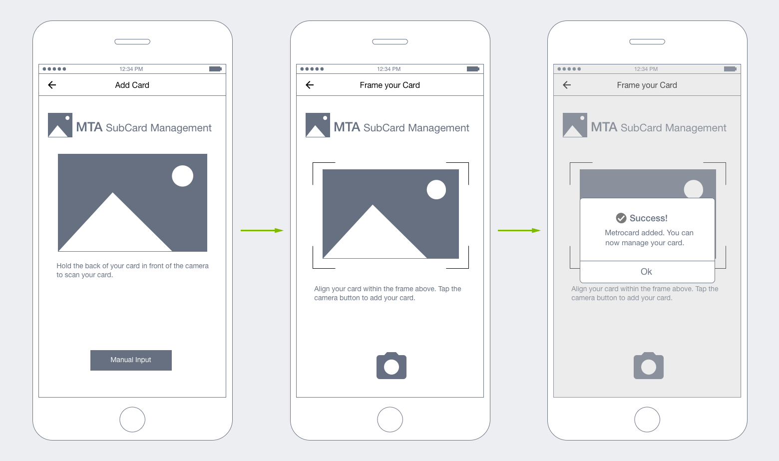
I began sketching the “Welcome and add a card walkthough” because I thought users would like to have an understanding of where to begin. This later expanded to a sign on process so users could feel more “secure” about the app (and feel confident about storing their credit card info for card reloads).
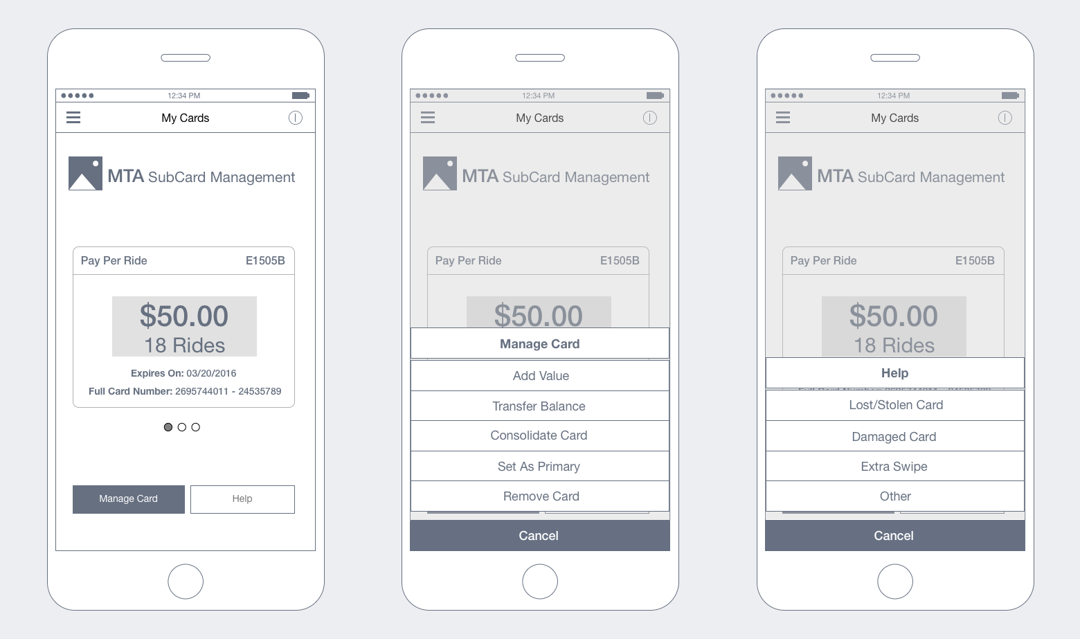
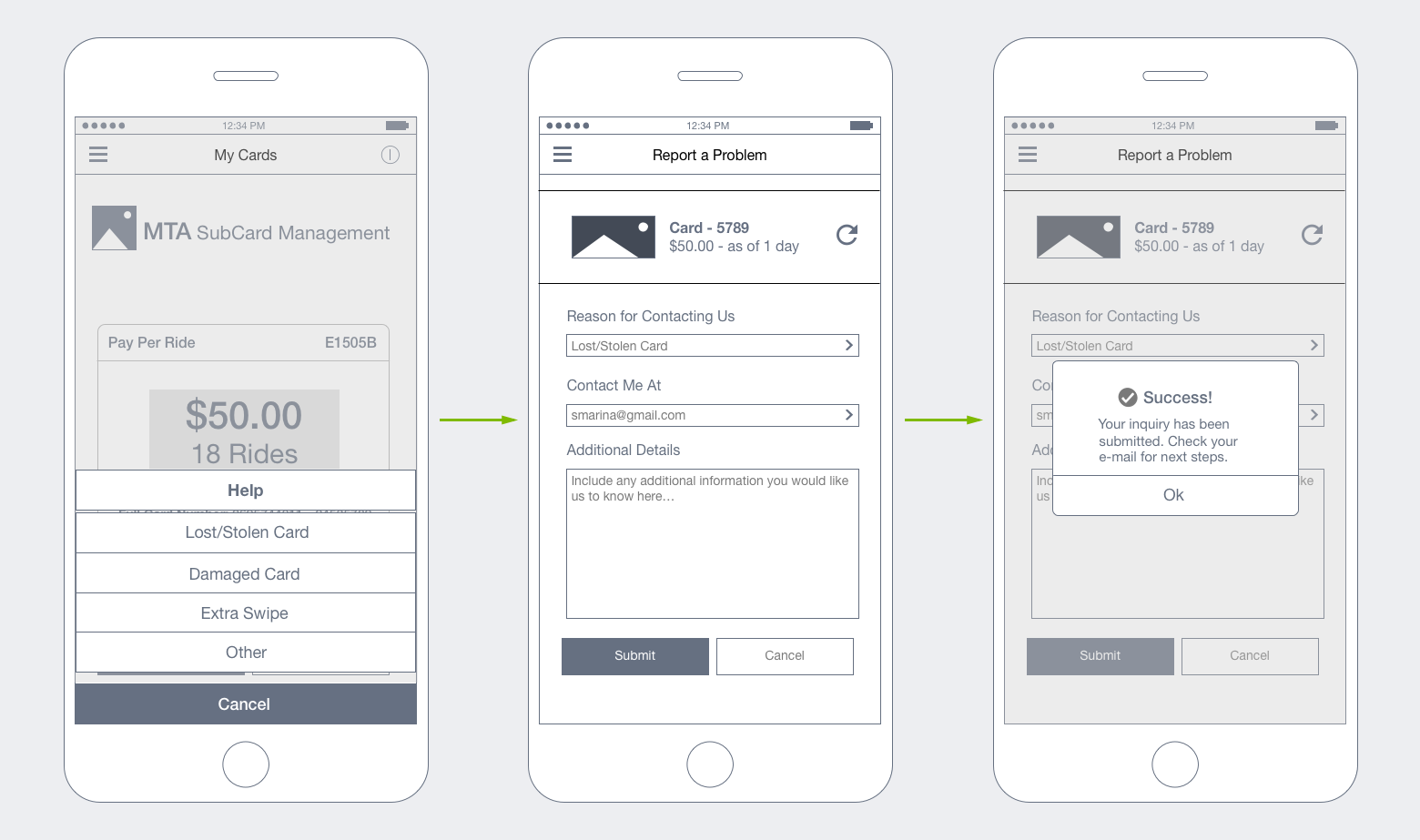
“Main” and “Secondary” screen sketches (respectively) depict key points in a journey that a user would hit if they choose to manage/get help with their card(s). As I began wireframing, I was able to fully incorporate these screens in order to map out a complete user journey.
Wireframes reflect tasks that a user may want to undertake when managing their metrocard(s). These wireframes are the result of user research, competitive research and general assumptions that I had to make.
Next steps for this project will include creation of an interactive prototype and usability research. Results will be incorporated into a revised design that will provide the basis for visual design.
Overview: As part of a visual design course that I took at the General Assembly, I was asked to translate a creative brief into a comprehensive brand and design strategy for a start-up, LiquidLab.
The Goal: To raise awareness of the LiquidLab brand as a boutique cold press juice bar which offers their customers unique juices and smoothies.
The objective for the brand is to enrich people’s lives by giving them access to healthy and delicious juices, either pre-made or customized.
I wanted the above objective to be easily attainable. As a result, I thought that creating a distinct online presence would be the best solution. Key features of an online presence included:
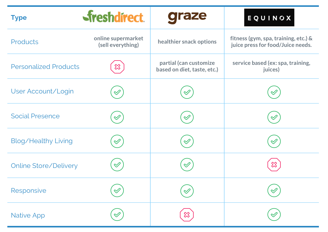
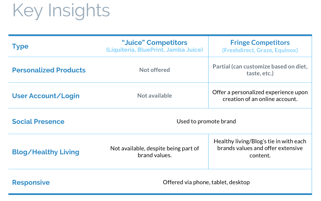
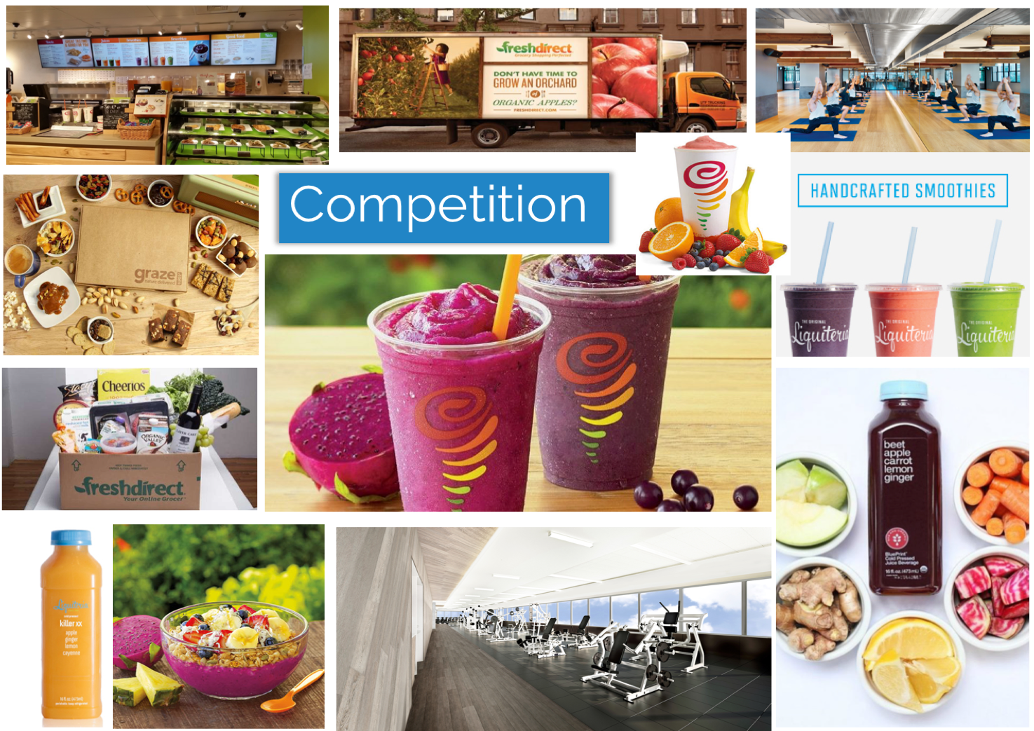
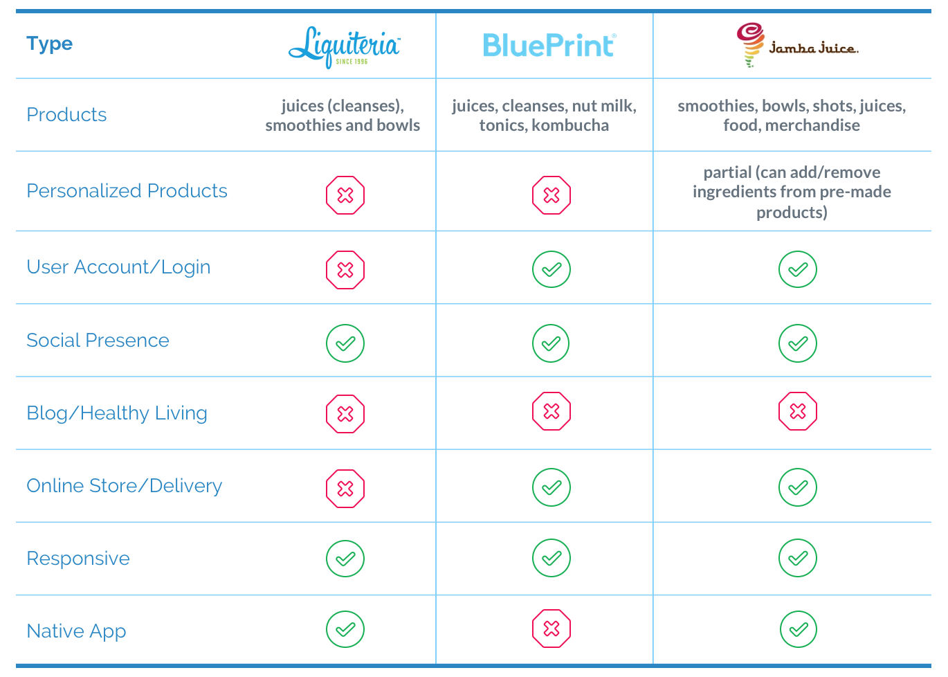
Looking at the competition served as the basis for what I wanted to include in my landing page. I explored two types of competitors, direct vs. fringe. The following illustrates my findings.
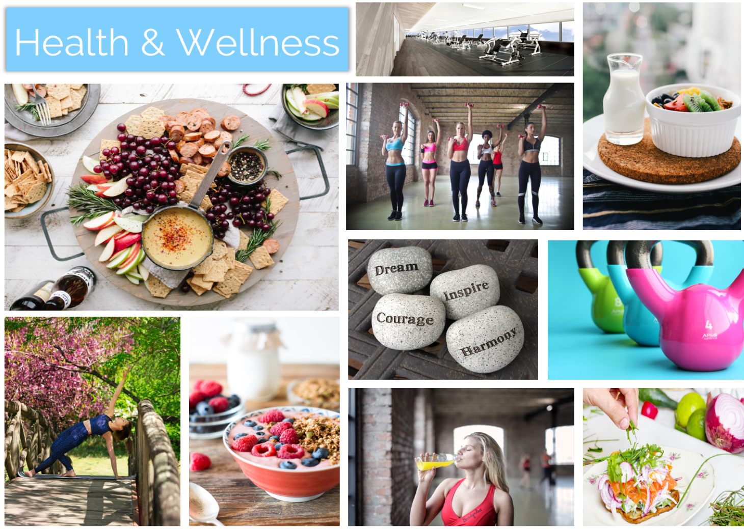
I created three mood boards, focusing on Fresh, Health & Wellness and Competitors.
I choose keywords “Fresh” and “Health & Wellness” because they best aligned with the brand values of providing locally sourced juices/smoothies that fit into a healthy lifestyle.
These mood boards would serve as one of the elements informing my final design.

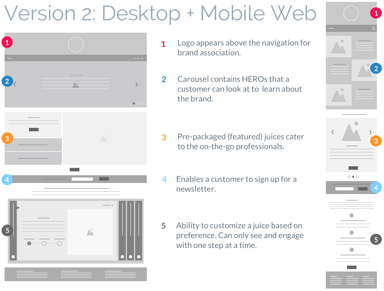
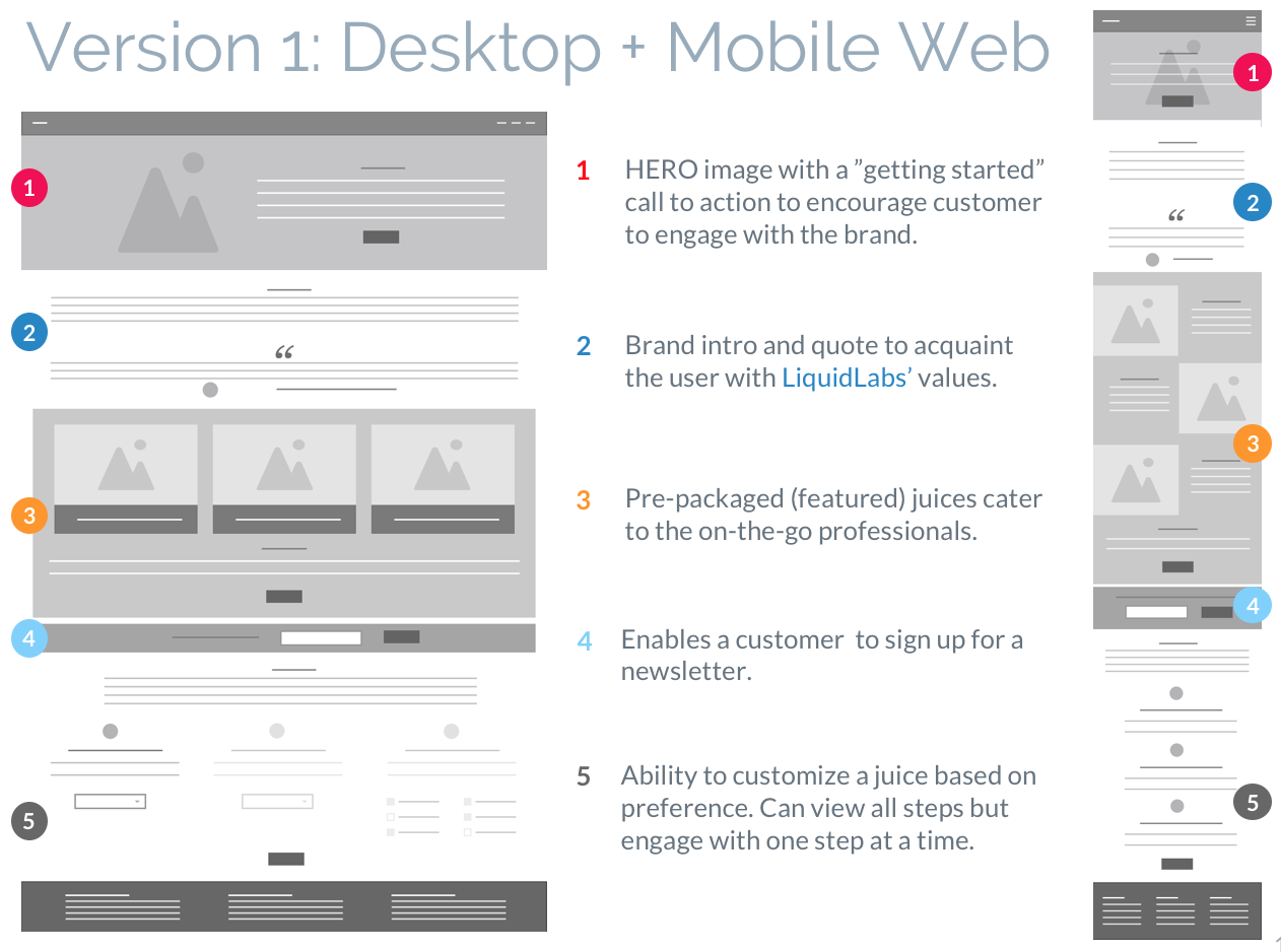
A total of four low fidelity versions of the landing page were created (2 for Desktop + 2 for Mobile Web). The idea was to explore different layout elements/hierarchy within the page. In the end, I created a third version which was a hybrid of the ones below. The hybrid version was born out of research that I did with friends and family.
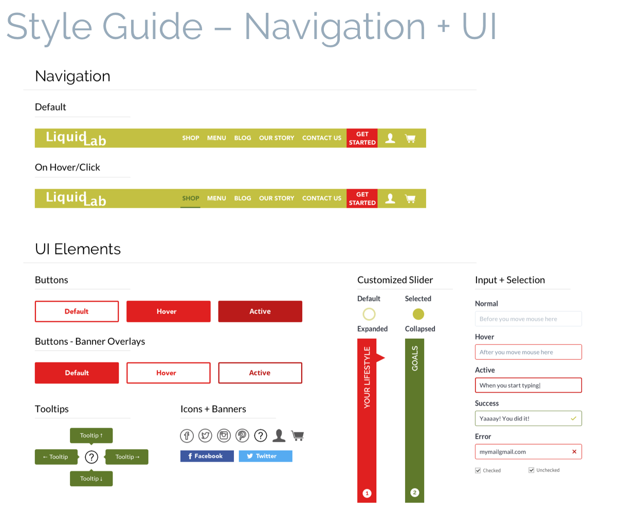
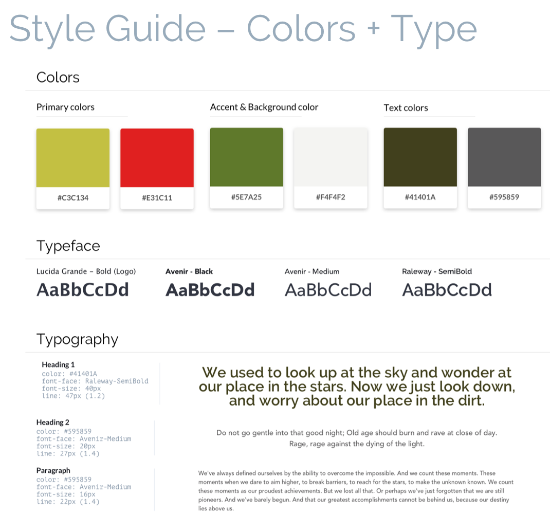
In defining the visual style, I wanted my design to accomplish the following. These elements were the basis of a style guide found below.
Typography – I paired Avenir (headings) with Raleway (body). The intention behind this pairing was to have a strong and bold title to contrast with a rounder body text, capturing the essence this brand has without being too overwhelming.
Lucida Grande was used for the logo as it was close to Avenir in boldness yet a bit more playful; a playfulness I wanted the logo to have.
Color + Photography – Mood boards, research and competitive analysis served to inform direction of the visual style of the brand: fresh and vibrant yet not overwhelming.
Color and imagery was used sparingly as to not take away from the ultimate objective of the brand; Enrich people’s lives by giving them access to healthy and delicious juices, either pre-made or customized.
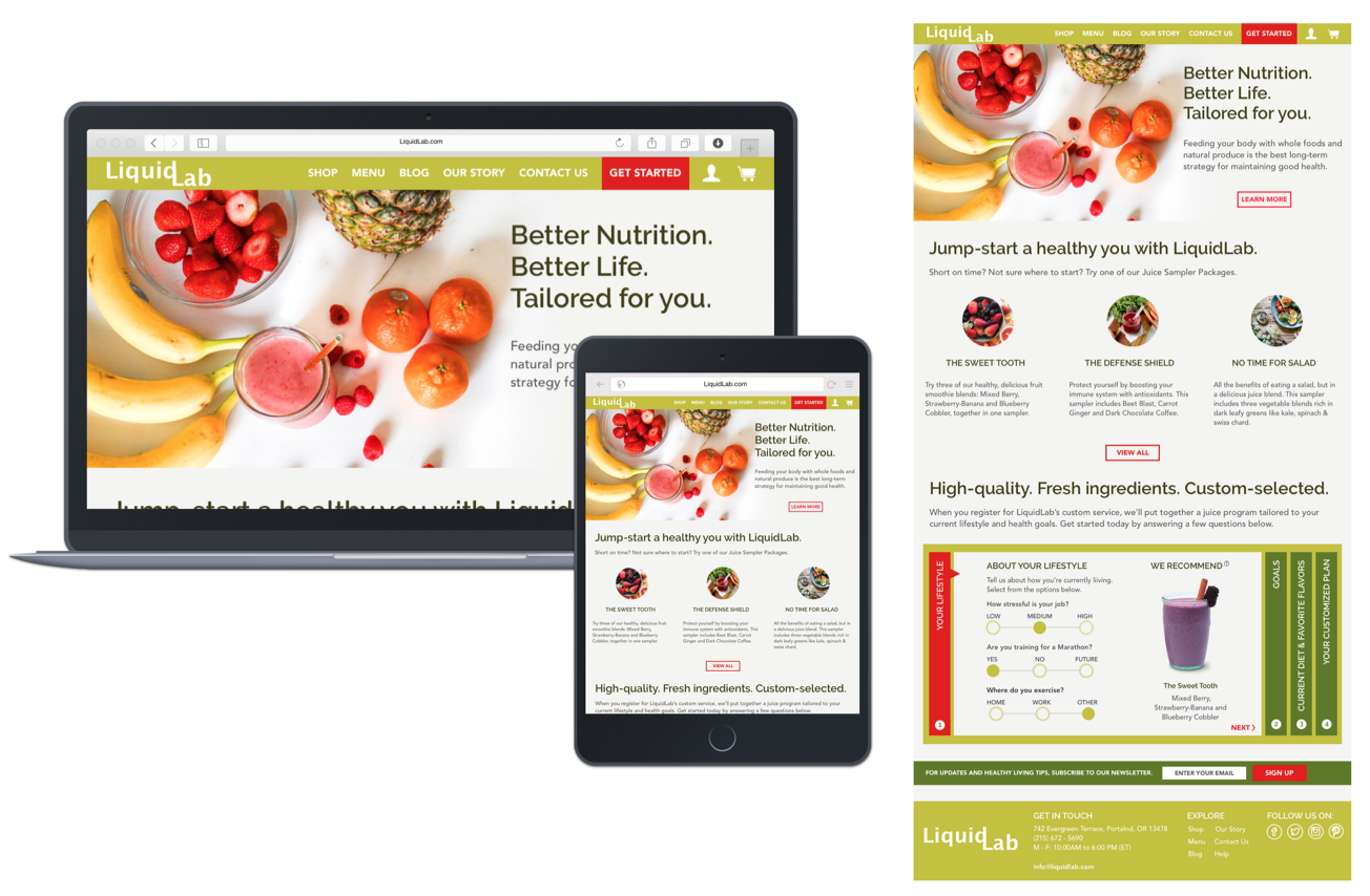
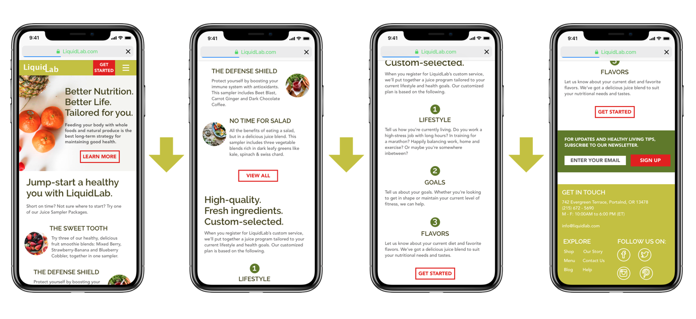
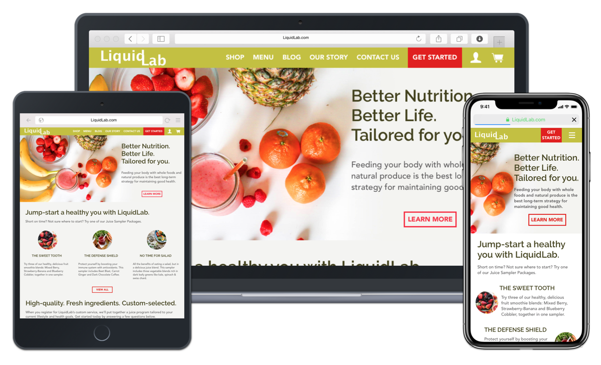
In applying the visual style into the design, I made several design decisions in regards to photography, text composition and order of website information that altered the look and feel of the final landing page.

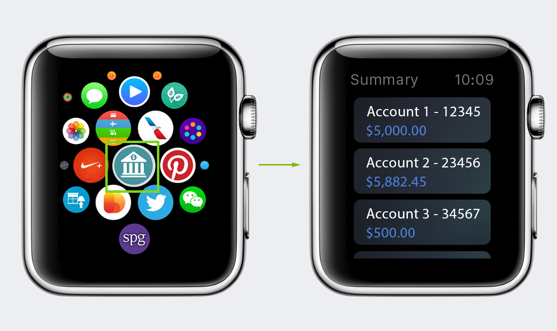
In taking a UX course at NYU, I was asked to create an app/website of my choosing for a final project. As such, I decided to create an account servicing application for the Apple watch (just announced to the public). The idea behind the app was to allow users to manage their account(s) online from a single app, targeted at credit, debit and prepaid cards.
I began with looking at as many news articles as I could get my hands on to familiarize myself with the apple watch. As the product was unreleased, this was the best way to learn about what was to come.
I started with creating a list of features which I wanted within the app. These features then fed into a site map. I followed the “beta” design standards (and a lot of speculation) to create wireframes that I thought might work. This proved particularly challenging as I had to “guess” on how certain features of the app would behave on the watch.
With an unreleased product getting a lot of attention, I knew user research was especially critical to the success of my app. I put together a research plan to test overall usability and features that I wanted included in the app. I uncovered the following:
Upon completion of user interviews and release of the watch, I revised my wireframes and sitemap to reflect a more “realistic” product. I started with revising the sitemap first as it served as my guide in creating stronger wireframes.
Revised Site Map served to:
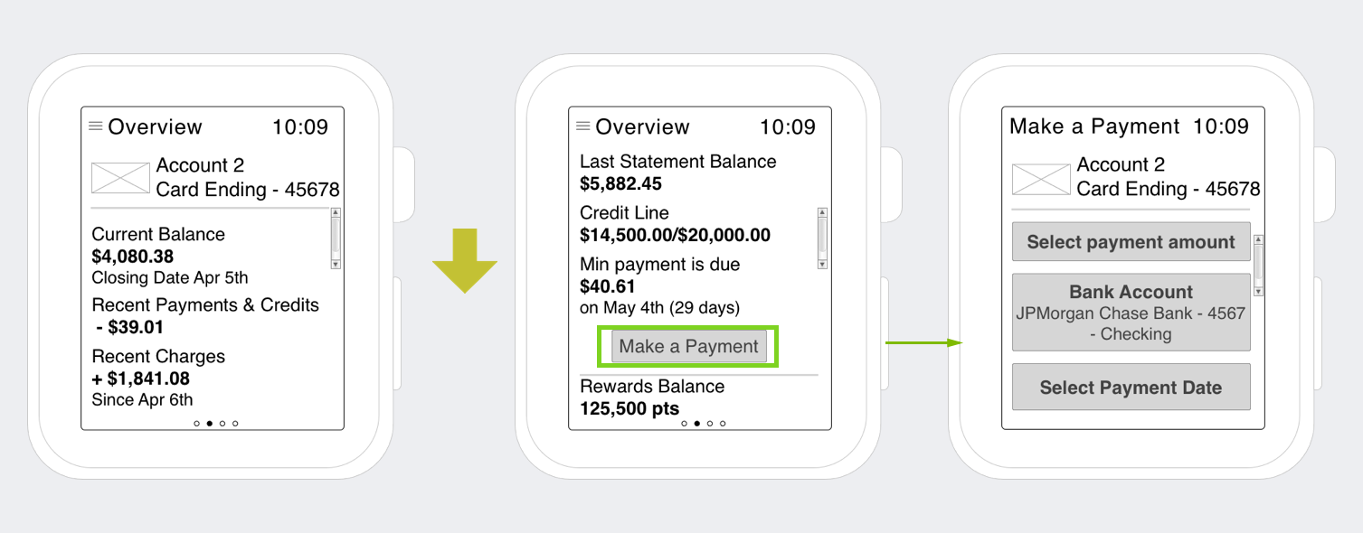
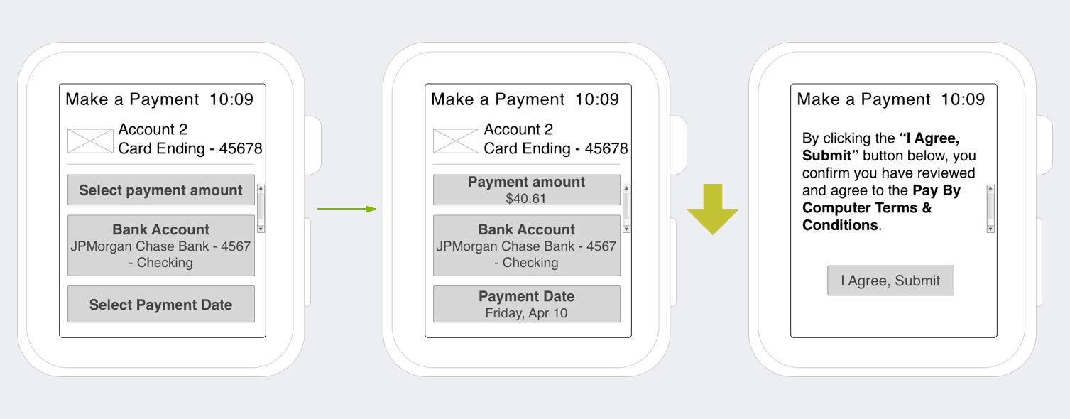
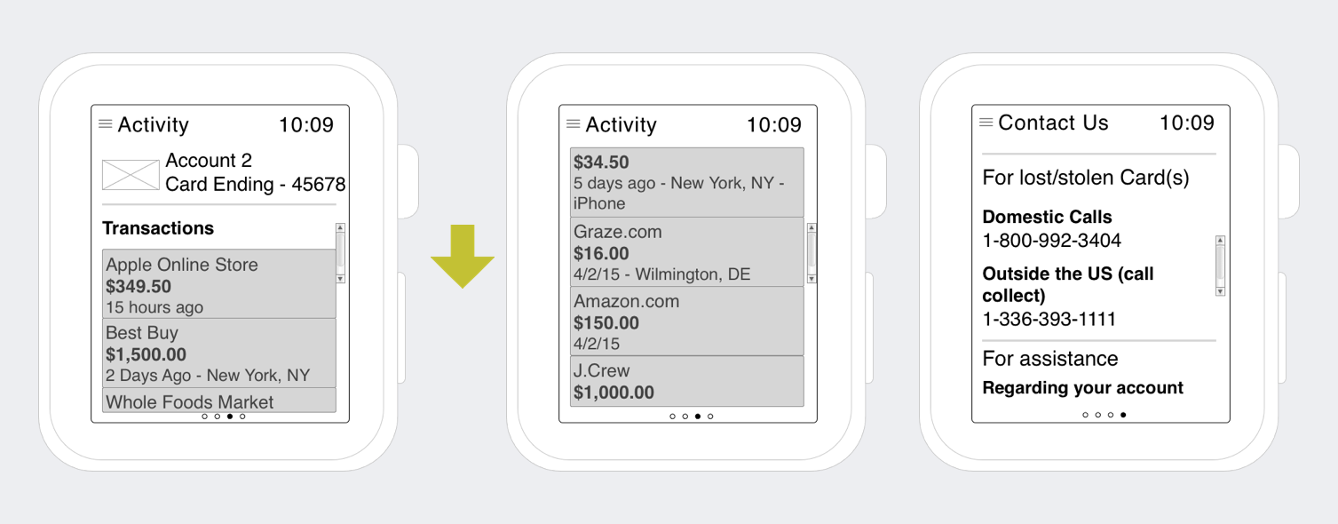
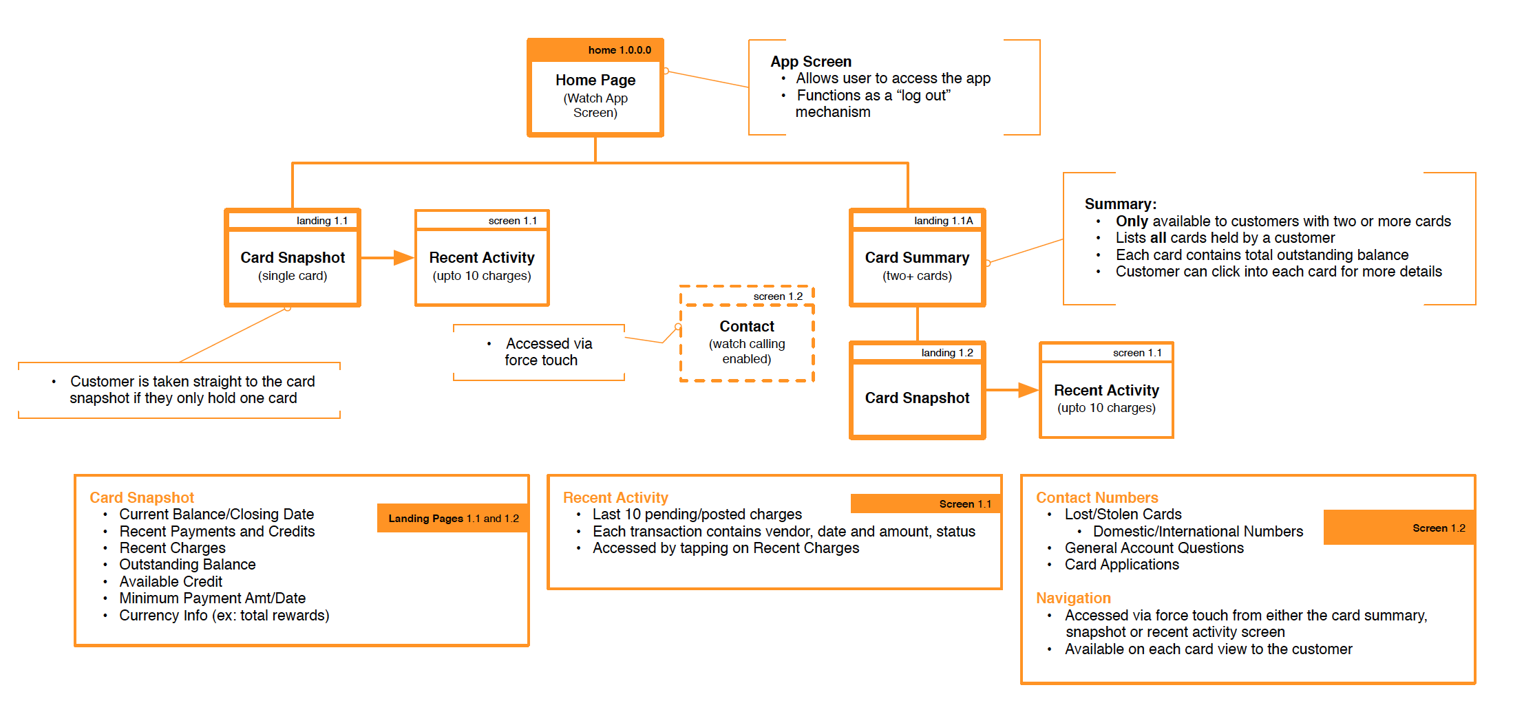 After I mapped out my app, I went to work on modifying the wireframes below. These modifications were incorporated into the visual design.
The modifications to the wireframes were a direct result of finalized design standards and user research. Certain parts of the wireframes such as making a payment were de-scoped upon release of the watch. The de-scoping was due to a few factors such as navigation, reliance on the iPhone to pass information to the watch, and response time.
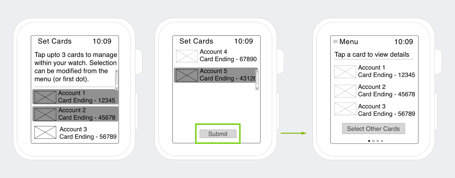
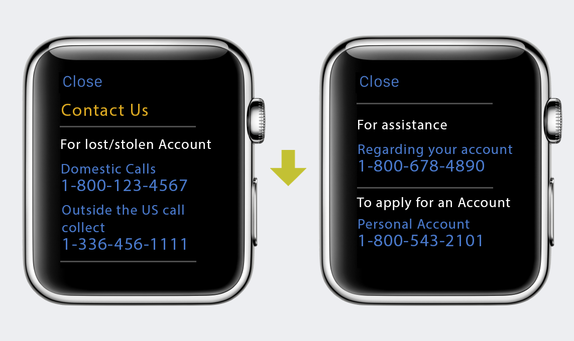
In taking user research and finalized design standards, I was able to create a visual design (below) that users would want to interact with and come back to.
As part of a design challenge, I was tasked with designing an interface for taxi dispatchers that addresses the need to keep track of and dispatch their vehicles, while monitoring their metrics and performance.
I decided to create a wireframe and user journey to visually showcase my solution. As the challenge had a time limit of two to three hours, I was limited in what I could do from a visual perspective.
I started with reviewing the brief provided in order to understand who I was designing for (taxi dispatcher) and possible challenges they may face.
After reviewing the brief, I decided to do some “desk” research of my own. I researched information on products that are similar to ones provided within the brief and ones that were related (ex: Uber, Lyft). Uber/Lyft were interesting to look at as they provide a similar service but cut out the middleman (taxi dispatcher) due to automation.
Keeping in mind the challenges of the dispatcher (dispatching vehicles while keeping an eye on their KPI’s) I envisioned a “dashboard” view that incorporated features of automated apps like Uber/Lyft (ex: map view, ratings, etc.) while surfacing some key KPI’s that a dispatcher may find important.
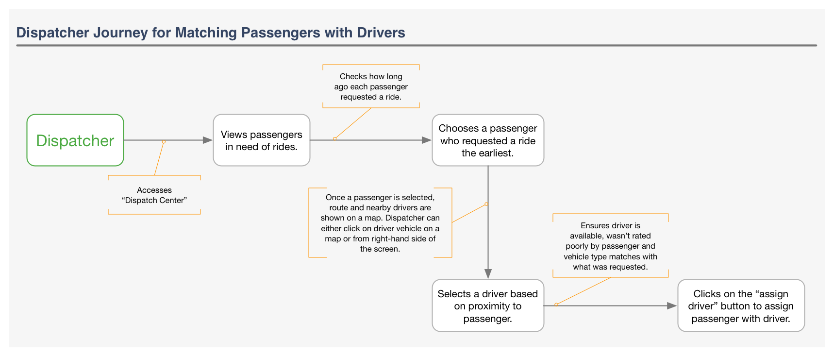
Before I could create my “dashboard” I thought it would be important to create a dispatcher journey map that detailed the process of pairing passengers with drivers.
As the “pairing” process is a key process that drives KPI’s I choose to focus on this process within my journey map. The journey map below served to influence the design of my dashboard.
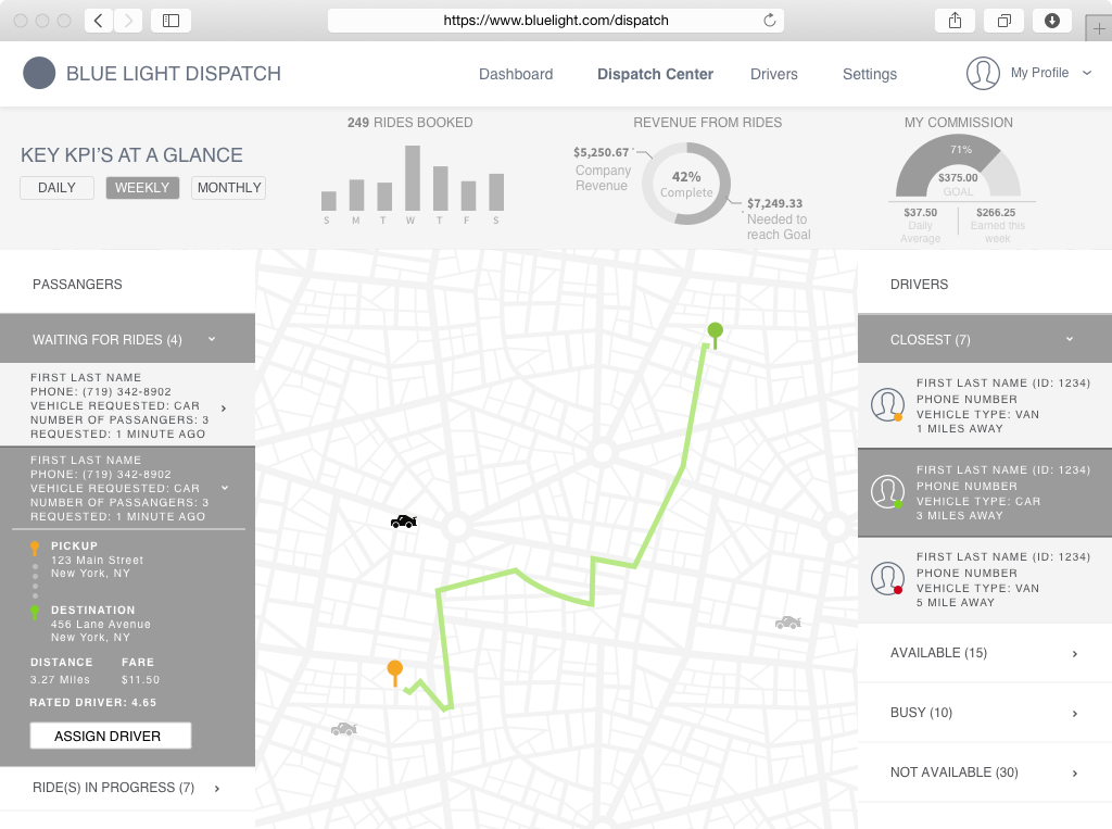
 After I had a clear sense of the pairing journey, it was time to put together a dashboard. The wireframe below reflects both, the journey of pairing passengers with drivers and also some of the key “KPI’s” that I thought were important to a dispatchers success. This wireframe is a result of the brief, “desk” research and general assumptions that I had to make.